How to Make Beautiful Charts with R and ggplot2
My first charts in R were horrible.
I thought that if the data was there, somewhere in the graph, that was good enough.
So when I was reading articles on the internet showing beautiful charts, I didn’t understand.
How could they have such beautiful charts?
Well, the explanation was easy.
They didn’t make them with R.
R has never been made to produce really good-looking charts.
Except..
R can produce really nice graphs.
And R graphics aren’t THAT hard to make.
In fact, the BBC is using R to create production-ready charts for their own articles!
And in this article, I will show you:
- What R is capable of
- How the BBC created its own R package
- A ggplot2 example so you can do the same and create shiny charts
You’ll soon be ready to create your own infographics with R!
Let’s get started.
What is R capable of?
To follow along with this article, let’s generate some data so that we’re all on the same page.
I will use the PokemonGO dataset that has been uploaded by Alberto Barradas on Kaggle: https://www.kaggle.com/abcsds/pokemongo
library(data.table)
pokemon <- fread("pokemonGO.csv")
head(pokemon)
#    Pokemon No.       Name Type 1 Type 2 Max CP Max HP                                                                              Image URL
# 1:           1  Bulbasaur  Grass Poison   1079     83   http://cdn.bulbagarden.net/upload/thumb/2/21/001Bulbasaur.png/250px-001Bulbasaur.png
# 2:           2    Ivysaur  Grass Poison   1643    107       http://cdn.bulbagarden.net/upload/thumb/7/73/002Ivysaur.png/250px-002Ivysaur.png
# 3:           3   Venusaur  Grass Poison   2598    138     http://cdn.bulbagarden.net/upload/thumb/a/ae/003Venusaur.png/250px-003Venusaur.png
# 4:           4 Charmander   Fire           962     73 http://cdn.bulbagarden.net/upload/thumb/7/73/004Charmander.png/250px-004Charmander.png
# 5:           5 Charmeleon   Fire          1568    103 http://cdn.bulbagarden.net/upload/thumb/4/4a/005Charmeleon.png/250px-005Charmeleon.png
# 6:           6  Charizard   Fire Flying   2620    135   http://cdn.bulbagarden.net/upload/thumb/7/7e/006Charizard.png/250px-006Charizard.png
And we simply want to show the relationship between Max CP and Max HP.
The former is the maximum amount of damage a pokemon can infringe. The latter is the maximum amount of damage a pokemon can receive.
To get started, I will show you three charts I can produce with almost no effort. They all will be of size 640x450.
Let’s see what native R is capable of:
png(filename = "base_r.png", width = 640, height = 450)
plot(`Max CP` ~ `Max HP`, data = pokemon)
dev.off()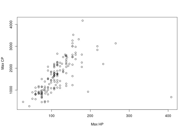
Yea..
We’ve seen better.
We can observe that there seems to exist a relationship between Max CP and Max HP, but would you use this chart in a magazine? Maybe not.
So Hadley Wickham and others created ggplot2.
According to the ggplot2 website, it is used to create elegant data visualizations using the grammar of graphics.
Let’s try it!
library(ggplot2)
ggplot(pokemon, aes(x = `Max HP`, y = `Max CP`)) +
    geom_point()
ggsave(filename = "base_ggplot.png", width = 640/72, height = 450/72, dpi = 72)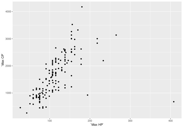
Alright, that’s a little bit better!
I mean, I’ve never been a fan of representing dots by empty circles.
The ggplot2 chart definitely looks cleaner.
And you don’t have to turn your head to read the y-axis labels.
And the font looks better.
But..
We’re still quite far away from a chart that carries your brand and that you’d be proud of showing in an article.
The bbplot package
The good thing about ggplot2 is that it’s a very powerful library that will give you a TON of control on the chart.
And when you want to add your own colors, your logo, your fonts, etc., rather than recreating everything all the time, you can bundle it in a package.
That’s what the BBC did (source).
Instead of creating these ugly charts, they created their own bbplot package to make BBC style graphics.
Look at what they’ve done with it:
Pretty neat, isn’t it?
Let’s try their package
I can’t wait..
library(bbplot)
p <- ggplot(pokemon, aes(x = `Max HP`, y = `Max CP`)) +
    geom_point() +
    bbc_style()
finalise_plot(p, source_name = "Source: Kaggle",
              save_filepath = "base_bbplot.png",
              width_pixels = 640, height_pixels = 450,
              logo_image_path = "pokemongo_logo.png")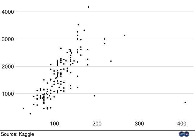
Well..
We’re definitely making some progress.
We can see some good stuff happening:
- The font sizes are really good compared to the previous two plots.
- It has a very clean look. The data/ink ratio is really good (click here if you don’t know what it is)
- They make it super easy to add the source and the logo of your company (I added the Pokemon GO logo).
But it’s not ideal either.
- The axis labels have disappeared. What are we even plotting here?
- It doesn’t feel like a BBC chart. I mean, it’s not as good-looking as the other graphics above.
- The function allowed me to specify a size in pixels, I chose 640x450, but the chart came up as 2666x1875. I had to resize it. (That’s because they apparently have 72 dpi by default, while I have 300, hence the 300/72 = 4.2 times bigger image)
My feeling simply is that the BBC package gives a big head start, but you have to work hard to make your charts look nice.
You still have to:
- Choose the right colors (someone opened an issue about that)
- add the annotations by hand
- customize all the nitty-gritty details that make the difference.
Which is kind of normal, since each chart is unique and needs to be customized to what you want to communicate.
But still.
Looking at the samples of BBC graphics, I expected more!
So..
What can we learn from their package?
It’s always a bit intimidating to look at what a package contains.
I’m afraid of seeing a bunch of interdependent functions and that I’ll spend days figuring everything out.
That’s not the case with the bbplot package.
They have only two functions.
The bbc_style function creates a ggplot2 theme by specifying a lot of details, such as the title fonts, the legend style, removing some grid lines, etc.
The finalise_plot function add the footer, the logo, and save the plot.
The second function doesn’t require any change.
The first function is where you can specify as many details as possible so that all your charts will have the same feel. The feel of your brand.
You can look at the function here: https://github.com/bbc/bbplot/blob/master/R/bbc_style.R
It’s very short.
My feeling is that they provide a really good starting point.
But if you want to come up with something more complete, feel free to specify all arguments of the ggplot2::theme function.
If you dive into their bbc_style function, you will notice a couple of things:
- They focus on creating a coherent style with the font, the sizes, and the basic colors.
- They remove a LOT of elements.
This second point is especially important that in the previous section, we mentioned that many things were missing (such as the axis labels).
This is something we want, to have a minimalist plot.
And only if you really need it, you will add more things.
A good point for a good data/ink ratio.
Notice that by using this package, we still haven’t coded anything by ourselves.
All we did was loading the bbplot package and building the plot with 3 lines of code.
Make a beautiful chart with ggplot2 and bbplot
Now we can try to make it look really good and I will show you some tricks.
I want to show you how to get started with a simple chart and improve it iteratively.
Iteration 0 - What we start with
Let’s recall what we started with:
library(bbplot)
p <- ggplot(pokemon, aes(x = `Max HP`, y = `Max CP`)) +
    geom_point() +
    bbc_style()
finalise_plot(p, source_name = "Source: Kaggle",
              save_filepath = "base_bbplot.png",
              width_pixels = 640, height_pixels = 450,
              logo_image_path = "pokemongo_logo.png")
I won’t repeat the library loading and finalise_plot function all the time as I do not expect to change them.
We’ll focus instead of the ggplot building.
Iteration 1 - Add a title
The first thing I want to add is a title so that we know what we’re plotting.
It’s easy to do with the labs function.
I’m also changing the color to fit the Pokemon GO logo:
p <- ggplot(pokemon, aes(x = `Max HP`, y = `Max CP`)) +
    geom_point() +
    # Title
    labs(title = "Relationship between Max CP and Max HP") +
    # Style
    bbc_style() +
    theme(plot.title = element_text(color = "#063376"))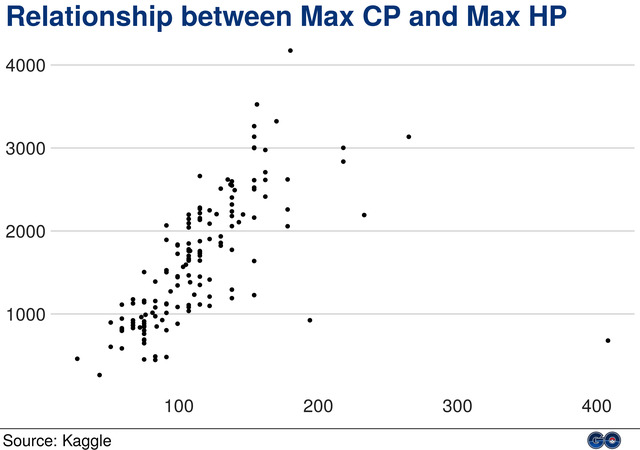
Iteration 2 - Improve axis labels
I could add axis names, but the bbplot package make them disappear by default.
When axis names are required, that’s because it’s not clear what the chart is about.
With our new title, and by adding more information in the axis labels, we can omit axis names.
See by yourself:
p <- ggplot(pokemon, aes(x = `Max HP`, y = `Max CP`)) +
    geom_point() +
    # Title
    labs(title = "Relationship between Max CP and Max HP") +
    # Axis
    scale_x_continuous(labels = function(x) paste0(x, " HP")) +
    scale_y_continuous(labels = function(y) paste0(y, " CP")) +
    # Style
    bbc_style() +
    theme(plot.title = element_text(color = "#063376"))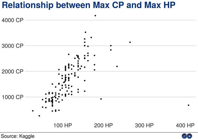
Iteration 3 - Add linear line
Our goal is to study the relationship between Max CP and Max HP.
This relationship appears to exist.
So it’d be a good idea to draw a line and show it.
That’s what the geom_smooth is used for.
In this case, I will use the arguments method = "lm" to have a linear line, and se = FALSE to remove the confidence bands, so that it doesn’t make the chart too heavy.
I’m also removing the Chansey pokemon to draw the line.
This pokemon is the point on the far right of the chart and it draws too much weight on the line.
Being an outlier, I prefer to remove it.
I choose the red color of the pokeball:
p <- ggplot(pokemon, aes(x = `Max HP`, y = `Max CP`)) +
    geom_smooth(data = pokemon[Name != "Chansey"], method = "lm",
                se = FALSE, col = "#ee1515") +
    geom_point() +
    # Title
    labs(title = "Relationship between Max CP and Max HP") +
    # Axis
    scale_x_continuous(labels = function(x) paste0(x, " HP")) +
    scale_y_continuous(labels = function(y) paste0(y, " CP")) +
    # Style
    bbc_style() +
    theme(plot.title = element_text(color = "#063376"))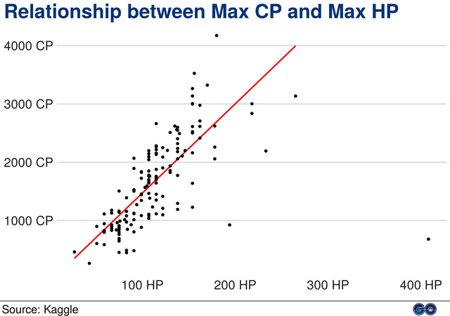
Iteration 4 - Add group colors
What if you want to visualize how different groups of pokemon fit in this chart?
Are Fire pokemons more powerful than Dragon pokemons?
Let’s add a new dimension to the plot by coloring the points conditionally to their type.
ggplot2 makes it really easy by adding a variable to the col argument in the aesthetics:
p <- ggplot(pokemon, aes(x = `Max HP`, y = `Max CP`)) +
    geom_smooth(data = pokemon[Name != "Chansey"], method = "lm",
                se = FALSE, col = "#ee1515") +
    geom_point(aes(col = `Type 1`)) +
    # Title
    labs(title = "Relationship between Max CP and Max HP") +
    # Axis
    scale_x_continuous(labels = function(x) paste0(x, " HP")) +
    scale_y_continuous(labels = function(y) paste0(y, " CP")) +
    # Style
    bbc_style() +
    theme(plot.title = element_text(color = "#063376"))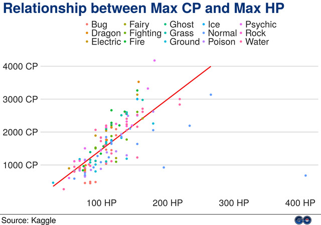
Iteration 5 - Improve color legend
Meh..
Adding colors is not super convincing.
It’s hard to see what color belongs to what pokemon type.
The ggplot2 default colors aren’t great.
I like better using colors from Tableau software.
You can find them here: Color Palettes from Tableau Software.
In our case, I’ll take the Tableau 20 colors since we have a lot of pokemon types (15).
Because the legend takes a lot of place, I will also reduce its font size:
colors <- c("#1F77B4", "#AEC7E8", "#FF7F0E", "#FFBB78", "#2CA02C",
            "#98DF8A", "#D62728", "#FF9896", "#9467BD", "#C5B0D5",
            "#8C564B", "#E377C2", "#7F7F7F", "#BCBD22", "#17BECF")
p <- ggplot(pokemon, aes(x = `Max HP`, y = `Max CP`)) +
    geom_smooth(data = pokemon[Name != "Chansey"], method = "lm",
                se = FALSE, col = "#ee1515") +
    geom_point(aes(col = `Type 1`)) +
    # Title
    labs(title = "Relationship between Max CP and Max HP") +
    # Axis
    scale_x_continuous(labels = function(x) paste0(x, " HP")) +
    scale_y_continuous(labels = function(y) paste0(y, " CP")) +
    # Legend
    scale_color_manual(values = colors) +
    # Style
    bbc_style() +
    theme(plot.title = element_text(color = "#063376")) +
    theme(legend.text = element_text(size = 14))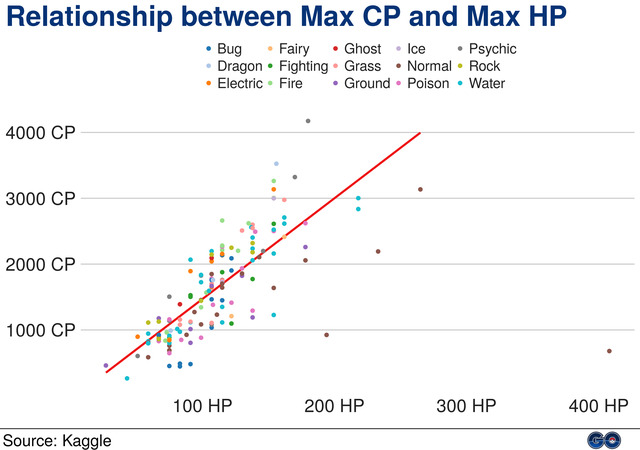
Iteration 6 - Make tough choices
These colors offer a bit more contrast, but it still isn’t perfect.
In fact, when you have so many categories, it’s near to impossible to plot them with colors, or line types, etc.
It would be possible with a bar chart, but then we wouldn’t be able to see the relationship between Max CP and Max HP anymore.
You have to make a choice:
- Either you don’t display the pokemon types.
- Or you reduce the number of categories.
I’ll take the 2nd one.
A table shows me that some types are rare:
sort(table(pokemon$`Type 1`))
#    Fairy      Ice   Dragon    Ghost Fighting   Ground  Psychic Electric     Rock      Bug     Fire    Grass   Poison   Normal    Water
#        2        2        3        3        7        8        8        9        9       12       12       12       14       22       28
I will keep only the types that have at least 10 pokemons, and gather everything else in “Other”:
table_pokemon <- table(pokemon$`Type 1`)
pokemon[, type_1 := ifelse(table_pokemon[`Type 1`] >= 10,
                           `Type 1`, "Other")]
pokemon[, type_1 := factor(type_1, c("Bug", "Fire", "Grass", "Normal",
                                     "Poison", "Water", "Other"))]
sort(table(pokemon$type_1))
#    Bug   Fire  Grass Poison Normal  Water  Other
#     12     12     12     14     22     28     51
I also reordered the factors to make sure that “Other” finds itself in last position (rather than by alphabetical order).
Let’s adapt our chart code and see what happens:
p <- ggplot(pokemon, aes(x = `Max HP`, y = `Max CP`)) +
    geom_smooth(data = pokemon[Name != "Chansey"], method = "lm",
                se = FALSE, col = "#ee1515") +
    geom_point(aes(col = type_1)) +
    # Title
    labs(title = "Relationship between Max CP and Max HP") +
    # Axis
    scale_x_continuous(labels = function(x) paste0(x, " HP")) +
    scale_y_continuous(labels = function(y) paste0(y, " CP")) +
    # Legend
    scale_color_manual(values = colors,
                       guide = guide_legend(nrow = 1)) +
    # Style
    bbc_style() +
    theme(plot.title = element_text(color = "#063376"))
Much better!
The colors are distinguishable.
Note that I don’t need anymore to reduce the font size of the legend.
And I forced the legend to be displayed on 1 row so that we have more place for the actual chart.
What’s next?
Iteration 7 - Add annotations
Where is Pikachu?
And who’s that guy on the far right that seems to be so weak and have so many HPs?
And who are the most powerful pokemons?
Let’s add annotations to display this extra information on the chart.
p <- ggplot(pokemon, aes(x = `Max HP`, y = `Max CP`)) +
    geom_smooth(data = pokemon[Name != "Chansey"], method = "lm",
                se = FALSE, col = "#ee1515") +
    geom_point(aes(col = type_1)) +
    # Arrow for pokemon Chansey
    geom_curve(aes(x = 375, y = 1500, xend = 404, yend = 860),
               colour = "#555555", curvature = -.2, size = .5,
               arrow = arrow(length = unit(0.03, "npc"))) +
    geom_label(aes(x = 330, y = 1400, label = "Chansey"),
               hjust = 0, vjust = 0, colour = "#555555",
               fill = "white", label.size = NA, size = 6) +
    # Arrow for pokemon Pikachu
    geom_curve(aes(x = 50, y = 1400, xend = 65, yend = 880),
               colour = "#555555", curvature = .2, size = .5,
               arrow = arrow(length = unit(0.03, "npc"))) +
    geom_label(aes(x = 50, y = 1460, label = "Pikachu"),
               hjust = .75, vjust = 0, colour = "#555555",
               fill = "white", label.size = NA, size = 6) +
    # Arrow for pokemon Snorlax
    geom_curve(aes(x = 290, y = 3335, xend = 270, yend = 3135),
               colour = "#555555", curvature = -.2, size = .5,
               arrow = arrow(length = unit(0.03, "npc"))) +
    geom_label(aes(x = 290, y = 3255, label = "Snorlax"),
               hjust = .3, vjust = 0, colour = "#555555",
               fill = "white", label.size = NA, size = 6) +
    # Arrow for pokemon Mewtwo
    geom_curve(aes(x = 155, y = 4100, xend = 175, yend = 4150),
               colour = "#555555", curvature = .2, size = .5,
               arrow = arrow(length = unit(0.03, "npc"))) +
    geom_label(aes(x = 155, y = 4100, label = "Mewtwo"),
               hjust = 1, vjust = .3, colour = "#555555",
               fill = "white", label.size = NA, size = 6) +
    # Title
    labs(title = "Relationship between Max CP and Max HP") +
    # Axis
    scale_x_continuous(labels = function(x) paste0(x, " HP")) +
    scale_y_continuous(labels = function(y) paste0(y, " CP")) +
    # Legend
    scale_color_manual(values = colors,
                       guide = guide_legend(nrow = 1)) +
    # Style
    bbc_style() +
    theme(plot.title = element_text(color = "#063376"))
Here is a bigger version of the final chart (click to zoom):
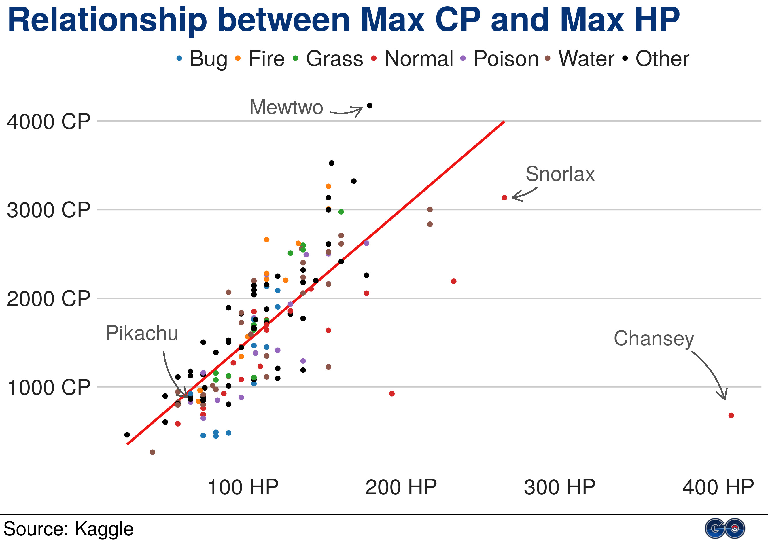
See what we did?
Look back to where we started and notice the difference.
ggplot2 is a very powerful package to make beautiful charts.
Start with a package like bbplot that will give you a head start with good foundations.
And then build up your chart, piece by piece, until reaching the result you want.
Comments
Leave a Comment
Required fields are marked *